Designing Adaptive User Interfaces
This guide aims to show developers and designers how to use the components provided by GTK with those from the libhandy library to create applications both for the Librem 5 phone and for traditional desktop and laptop systems.
This guide assumes that you are familiar with the basics of GTK application development. It also assumes you are using GTK 3.24 or newer and libhandy 0.0.10 or newer as these versions have improved support for adaptive apps over previous versions.
Introduction
libhandy is a widget library for GTK that contains widgets useful for both phone applications and adaptive applications. It extends the standard collection of widgets provided by GTK for this purpose. The libhandy documentation covers the range of widgets available.
This library is central to the way that adaptive applications are created using GTK. The following sections show how each of its components are employed to make new or existing GTK-based user interfaces adaptable. The Porting GNOME Applications guide covers more specific issues related to converting traditional applications to fit the adaptive paradigm.
For general GTK and GNOME development resources please consult the GTK/GNOME Resources page and the GTK 3 documentation.
Style Guidelines
Applications are expected to follow the GNOME Human Interface Guidelines where possible, to the extent that they apply to the application’s environment.
Header Bars
HdyTitleBar is a simple container that takes care of the title bar’s appearance, ensuring that header bars look good when animated by preventing them from drawing the title bar’s background themselves. The class also simplifies common operations, like setting the selection mode. A simple example that uses HdyTitleBar can be found in the first part of the Adaptive UI.
Some title bars are composed of multiple header bars, in such a case it is advised to separate them with a GtkSeparator with the sidebar style class. To help spread the window decoration across all header bars as if they were only one, just show the close button on all of your header bars and put them into a HdyHeaderGroup in the same order they appear in the title bar. This is also the correct way to manage header bars when using them with leaflets.
Here is an simple GtkBuilder example showing this section’s advice:
<?xml version="1.0" encoding="UTF-8"?>
<interface>
  <object class="GtkWindow">
    <child type="titlebar">
      <object class="HdyTitleBar">
        <child>
          <object class="GtkBox">
            <child>
              <object class="GtkHeaderBar" id="start_header">
                <property name="show-close-button">True</property>
              </object>
            </child>
            <child>
              <object class="GtkSeparator">
                <style>
                  <class name="sidebar"/>
                </style>
              </object>
            </child>
            <child>
              <object class="GtkHeaderBar" id="end_header">
                <property name="show-close-button">True</property>
              </object>
            </child>
          </object>
        </child>
      </object>
    </child>
  </object>
  <object class="HdyHeaderGroup">
    <headerbars>
      <headerbar name="start_header"/>
      <headerbar name="end_header"/>
    </headerbars>
  </object>
</interface>
Application Menus
To demonstrate the use of primary menus, we created an example application, just clone it in GNOME Builder and check the app-menu branch out.
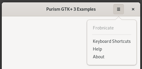
A primary menu in action
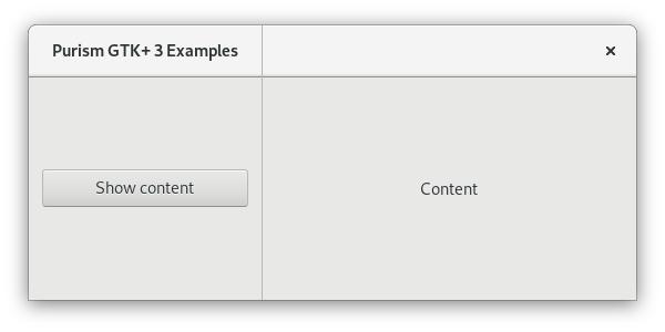
Leaflets
The main content area of an application’s primary window can contain a number of widgets. When there are many widgets, it becomes difficult to ensure that they will all fit within the available space on the screen. To help with this problem we use leaflets, widgets that can conceptually fold and unfold pages of content to fit within the available viewing area.
Adaptive Labels
Using default GtkLabel widgets can prevent your application’s UI from working correctly on small screens. By configuring them with the appropriate properties, they can be made to adapt to changes in window size and screen orientation.
Ellipsize each Label
Allowing your label to ellipsize will cut a part of your string when there isn’t enough space for it, you can enable it and choose which part will be cut with the GtkLabel ellipsize property. Use it if you really need your label to be on a single line.
If you allow your label to be ellipsized, make sure that its xalign property matches its justification or your label may not be properly aligned when ellipsized: 0 for left, 1 for right, or 0.5 for center.
If an ellipsized label has an HdyLeaflet for ancestor and you want the label to be ellipsized before the leaflet folds itself, try wrapping your label in a GtkScrolledWindow, optionally expanding the scrolled window horizontally. Don’t worry, it won’t surround your label with scrollbars but just trick the sizing system into doing what you expected it to do.
Enable Word Wrap
Letting your label wrap will preserve the integrity of the text at the expense of more height, you can enable it with the GtkLabel wrap property and choose how to wrap with the GtkLabel wrap-mode property.
By allowing the label to wrap, it will always request enough height when fully wrapped. Consider putting your label or a widget containing it into a scrollable window to avoid height becoming a problem.
To help you implement these, we created an example application, just clone it in GNOME Builder and check the adaptive-labels branch out.
Selection Mode
As per the GNOME human interface guidelines, applications may enter a special selection mode. The use of HdyTitleBar and recent improvements in the default theme of GTK both simplify use of selection mode. Simply toggle the selection-mode boolean property of HdyTitleBar for their descendants to be styled accordingly, including separators with the sidebar style class.
Dialogs
When an application needs to ask the user a question or confirm an action, it may open a dialog to receive input. To ensure that the dialog is correctly shown to the user it should be associated with a window – this is usually the application’s main window. On the Librem 5, doing this will ensure that the dialog will always appear in front of the window.
This is automatically done when creating dialogs using Handy.Dialog. However, for regular Gtk.Dialog instances, it may be necessary to set each dialog to be a transient child window of the application window.
Adaptive Grid Layout
Some applications have a grid layout where several panels sit side-by-side and extend to the title bar. To make an application with a adaptive grid layout, follow these steps:
- The basic layout:
- In the title bar put a HdyTitleBar, put a HdyLeaflet in it in which you will put your sidebar’s GtkHeaderBar, a GtkSeparator and your content’s GtkHeaderBar.
- In the window put a HdyLeaflet in which you will put your sidebar widget, a GtkSeparator and your content widget.
- Add the sidebar style class to the separators from the titelbar and the window.
- Make the close buttons of your header bars visible.
- Make it a grid:
- Put your sidebar widget and its header bar into the same horizontal GtkSizeGroup to ensure they request the same minimum width.
- Put your separators into the same horizontal GtkSizeGroup to ensure they request the same minimum width.
- Put your content widget and its header bar into the same horizontal GtkSizeGroup to ensure they request the same minimum width.
- Horizontally expand the content widget and the content header bar.
- Solidify the layout:
- Give the sidebar child name to your sidebar widget and its header bar.
- Give the content child name to your content widget and its header bar.
- Make your header bar leaflet’s child and mode transitions to slide to improve spacial navigation semantics.
- Bind your window’s leaflet’s visible child name and your child and mode transitions (duration and type) to your header bar leaflet’s in a bidirectional way to ensure they always appear as a single unified panel.
- When the leaflets are folded, make the header group focus on the currently visible header bar, make it focus on nothing otherwise.
- Navigate in the layout:
- Add a back button at the start of your content header bar.
- When your header bar leaflet is folded, make the back button visible, make it invisible otherwise.
- When the back button is clicked, make the sidebar the visible child of the leaflets.
- When an entry of your sidebar is clicked, make the content visible.
To help you implement these, we created an example application, just clone it in GNOME Builder and check the adaptive-grid-layout-0-0-3 branch out.
Kinetic Scrolling
User interfaces designed for traditional desktop environments tend to rely on input devices that map different kinds of interactions to different buttons and inputs, such as mouse buttons and scrollwheels. Actions such as scrolling the contents of a window are made more convenient by scrollwheels.
Since traditional scrollbars are fiddly to use on touchscreens, it is usual to allow views to be scrolled by touching and dragging their contents directly. Kinetic scrolling makes the use of touch scrolling more convenient by allowing the contents of the view to continue scrolling after the user has released their touch, simulating the effects of inertia.
Kinetic scrolling is enabled on a Gtk.ScrolledWindow widget by setting its kinetic_scrolling property. The following code is used by the Pictures example to add kinetic scrolling to a view containing a list of thumbnails:
page = Gtk.ScrolledWindow(
    halign='center',
    kinetic_scrolling=True,
    min_content_width=self.thumbnail_width * 2
)
Aspects of kinetic scrolling behavior can be customized by handling the widget’s edge-overshot and edge-reached signals, though the default behavior should be acceptable for most use cases.