Part 3: Synchronizing Two Leaflets
Overview
When run, the application described in this part of the tutorial shows a window with two leaflets. One is used for the title bar, the other for the window contents. When the window is resized or updated, the leaflets adapt and remain in sync with each other.
The main source code for the application can be found in the main.py file
within the src directory. The purpose of the other files is explained in
other tutorials, such as Your First Application.
Design
We begin by looking at an overview of the window layout we want to create.

On the left is a title above a left page containing a button. On the right is a subtitle containing a back button above a right page. When there is enough space to display both pages we want to hide the buttons; otherwise, we will show them so that the user can navigate between the pages.
The Program
We will not show all the main program here. Instead, we will focus on the parts that have changed since the previous part of this tutorial.
As before, almost everything is done in the do_activate method of the
Application class where the widgets that make up the user interface are
organized using leaflets:

As well as providing features for adaptive user interfaces, these two leaflets also help us to structure the code. First, we create a leaflet to hold the components of the title bar, then we create a leaflet to manage the main contents of the window.
Creating a Title Bar
In the do_activate method we create a application window and a title bar in a similar way to the previous part of this
tutorial. However, in this case, the title bar contains two Gtk.HeaderBar
widgets instead of one, both contained within a Handy.Leaflet widget that we
refer to as the title leaflet:
        title_bar = Handy.TitleBar()

        self.title_leaflet = Handy.Leaflet(
            child_transition_type='slide',
            mode_transition_type='slide'
        )
The first header bar contains the main heading for the window and a close button:
        header = Gtk.HeaderBar(
            title='Two Leaflets',
            show_close_button=True
        )
The second header bar contains a close button, but it is allowed to expand horizontally:
        sub_header = Gtk.HeaderBar(
            show_close_button=True,
            hexpand=True
        )

        back_button = Gtk.Button.new_from_icon_name('go-previous-symbolic', 1)
        sub_header.add(back_button)
It also contains a back button that is not part of the normal collection of window decorations, which we define separately. The subheader is allowed to expand horizontally to fill any available space – this causes the close button to be placed in the correct position when the window is fully expanded.
We call the add method to add the header and subheader to the leaflet,
calling the child_set method to give them names that the leaflet can use to
refer to them:
        self.title_leaflet.add(header)
        self.title_leaflet.child_set(header, name='left_page')
        self.title_leaflet.add(sub_header)
        self.title_leaflet.child_set(sub_header, name='right_page')
We can then add the leaflet to the title bar and make the window use it:
        title_bar.add(self.title_leaflet)
        window.set_titlebar(title_bar)
One final task remains for the title leaflet. We need to place the two header
bars in a Handy.HeaderGroup so that their layout and visibility can be
managed:
        header_group = Handy.HeaderGroup()
        header_group.add_header_bar(header)
        header_group.add_header_bar(sub_header)
This ensures that, for example, we do not see two close buttons when the window is expanded.
Composing the Pages
The contents of the window itself are also managed by a Handy.Leaflet that
we refer to as the content leaflet:
        self.content_leaflet = Handy.Leaflet(
            child_transition_type='slide',
            mode_transition_type='slide'
        )
We define the left page first, using a Gtk.Box that contains a label and a
button similar to the ones in the previous part of this tutorial:
page1 = Gtk.Box(
orientation='vertical',
hexpand_set=True
)
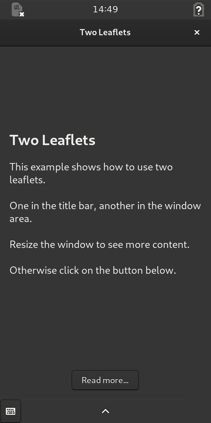
label = Gtk.Label(wrap=True)
label.set_markup(
'<span size="xx-large" weight="bold">Two Leaflets</span>\n\n'
'<span size="large">This example shows how to use two leaflets.\n'
'\nOne in the title bar, another in the window area.\n\n'
'Resize the window to see more content.\n\n'
'Otherwise click on the button below.</span>'
)
label.set_padding(8, 0)
more_button = Gtk.Button(label='Read more…', halign='center')
page1.pack_start(label, True, True, 16)
page1.pack_start(more_button, False, True, 16)
The right page is defined in a similar way, except that there is no need for a button in the page for navigation because the back button in the subheader is used for that purpose:
page2 = Gtk.Box(
orientation='vertical',
hexpand_set=True
)
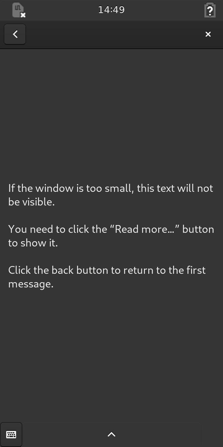
more_label = Gtk.Label(wrap=True)
more_label.set_markup(
'<span size="large">'
'If the window is too small, this text '
'will not be visible.\n\n'
'You need to click the “Read more…” button '
'to show it.\n\n'
'Click the back button to return to the first message.</span>'
)
more_label.set_padding(8, 0)
page2.pack_start(more_label, True, True, 16)
We use a Gtk.Box to hold the label so that we can control its placement in
the page.
Both pages are created with their hexpand_set properties set to True.
This allows them to expand horizontally if their child widgets require more
space.
Adding Pages to the Leaflet
With the two pages defined, we add them to the leaflet in the same way as
before, assigning names to them with the child_set method before adding the
leaflet to the window:
        self.content_leaflet.add(page1)
        self.content_leaflet.child_set(page1, name='left_page')
        self.content_leaflet.add(page2)
        self.content_leaflet.child_set(page2, name='right_page')

        window.add(self.content_leaflet)
Note that we use the same names to refer to the two pages as we used for the
headers: left_page and right_page. This helps us to synchronize the two
leaflets.
Aligning Headers and Content
We also want to make sure that each header is horizontally aligned with the content it is associated with.

This is done by placing each header in a Gtk.SizeGroup with its
corresponding page widget. The main header with the first page, the subheader
with the second:
        left_page_size_group = Gtk.SizeGroup(mode='horizontal')
        left_page_size_group.add_widget(header)
        left_page_size_group.add_widget(page1)

        right_page_size_group = Gtk.SizeGroup(mode='horizontal')
        right_page_size_group.add_widget(sub_header)
        right_page_size_group.add_widget(page2)
Because each size group is used in horizontal mode, these place constraints
on the widgets in each group to ensure that their widths are synchronized.
Binding Properties and Connecting Signals
We bind the visible-child-name property of the content leaflet to the
corresponding property in the title leaflet, causing them to be synchronized:
        self.content_leaflet.bind_property(
            'visible-child-name',
            self.title_leaflet, 'visible-child-name',
            GObject.BindingFlags.SYNC_CREATE
        )
This ensures that the appropriate header is always shown in the title bar for the current page. It is also why we define names for the pages when we added them to the leaflets.
Since the pages can be shown side-by-side, we want to hide the buttons in that
situation so that they are not confusing for users. To do this, we bind each
button’s visible property to the folded state of the leaflet it is
associated with:
        self.title_leaflet.bind_property(
            'folded',
            back_button, 'visible',
            GObject.BindingFlags.SYNC_CREATE
        )

        self.content_leaflet.bind_property(
            'folded',
            more_button, 'visible',
            GObject.BindingFlags.SYNC_CREATE
        )
This ensures that the buttons will only appear when the leaflets are folded. There is no need to show either of the buttons when the window is fully expanded.
We also connect each button’s clicked signal to a method that will show the
appropriate page when the user clicks it:
        back_button.connect('clicked', self.show_page, page1)
        more_button.connect('clicked', self.show_page, page2)
The connections only have an effect when the buttons are shown. It is not possible for the user to click them when the leaflets are folded.
Setting a Default Size
At the end of the do_activate method, we show the window and its contents:
        window.set_default_size(320, 512)
        window.show_all()
We assign a default size to the window to help inform the leaflets about the amount of available space to expect.
Turning the Page
The last thing to define in the Application class is the show_page
method that responds to clicked signals from the buttons:
    def show_page(self, button, page):
        self.content_leaflet.set_visible_child(page)
Here, the page supplied as an argument is passed to the content leaflet so that it can be shown.
Although we change the visible-child property to change the current page,
the visible-child-name property will also be updated. This means that the
property binding that we set up earlier will ensure that the title leaflet will
also be updated, keeping the leaflets synchronized.
Running the Application
See the Building the Applications and Packaging the Applications sections for information about building, packaging and running the application.
Summary
This part of the tutorial showed how two Handy.Leaflet widgets can be
connected together to ensure that the Gtk.HeaderBar shown in a window’s
title bar is synchronized with the corresponding widget in the window’s main
area.
We add two Gtk.HeaderBar widgets to a leaflet in the title bar, and we
add two Gtk.Box widgets to a leaflet in the window’s main area. Each leaflet
is responsible for showing one or both widgets it contains, depending on the
amount of space available.
We use a Handy.HeaderGroup to manage the header bars, avoiding problems with
duplicate window decorations, and we use Gtk.SizeGroup objects to keep
headers and pages aligned and sized correctly.
Each header bar is assigned a name using the title leaflet’s child_set
method. The corresponding page is assigned the same name using the content
leaflet’s child_set method. By binding the content leaflet’s
visible-child-name property to the corresponding property in the title
leaflet, we ensure that the two leaflets are synchronized.
Two buttons allow the current page to be changed by updating the leaflet’s
visible-child property. By binding the folded properties of the leaflets
with the visible properties of the buttons, we ensure that the buttons are
only shown when there is not enough space to show both pages at once.