Part 2: Using a Leaflet
Overview
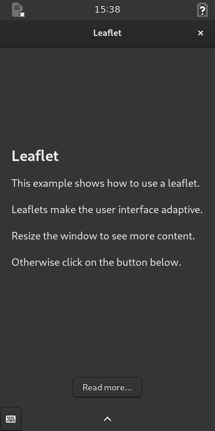
When run, the application described in this part of the tutorial shows a window containing text labels that can be shown side-by-side or individually depending on the available screen space.
The main source code for the application can be found in the main.py file
within the src directory. The purpose of the other files is explained in
other tutorials, such as Your First Application.
The Program
The main program is longer than in the previous part of this tutorial, so we will not show it all here. We will focus on the parts that are specific to this example.
Relevant Modules
The program begins by importing the modules it needs to create a user
interface. In addition to the standard Gtk module we use the Handy
module in order to access the widgets of the libhandy library:
gi.require_version('Handy', '1')
from gi.repository import Handy
Handy.init()
When importing the Handy module, it is important to specify the version of
the API that will be used.
Creating a Title Bar
The Application class provides the usual methods to set up the application
and perform tasks when it is run. In the do_activate method we set up the
user interface, beginning by creating a title bar:
    def do_activate(self):
        window = Gtk.ApplicationWindow(application=self)
        window.set_icon_name('com.example.leaflet_example')

        title_bar = Handy.TitleBar()
        header = Gtk.HeaderBar(title='Leaflet', show_close_button=True)

        title_bar.add(header)
        window.set_titlebar(title_bar)
This is done in the same way as in the previous part of this tutorial.
Using a Leaflet
The contents of the window itself are managed by a Leaflet from the libhandy
library which is created with two default attributes that describe how
transitions are performed – these enable animations for layout changes inside
the window:
        self.content_leaflet = Handy.Leaflet(
            transition_type='slide',
        )
The Leaflet widget is a container that manages the dimensions of its
children. We divide these into two pages that can be displayed side-by-side if
there is enough space, or are otherwise shown individually and can be flipped
between when the leaflet is folded.
Composing the Pages
We define the left page first, using a Gtk.Box that contains a label and a
button:
        page1 = Gtk.Box(orientation='vertical')

        label = Gtk.Label(wrap=True)
        label.set_markup(
            '<span size="xx-large" weight="bold">Leaflet</span>\n\n'
            '<span size="large">This example shows how to use a leaflet.\n\n'
            'Leaflets make the user interface adaptive.\n\n'
            'Resize the window to see more content.\n\n'
            'Otherwise click on the button below.</span>'
        )
        label.set_padding(8, 0)

        more_button = Gtk.Button(
            label='Read more…',
            halign='center'
        )

        page1.pack_start(label, True, True, 16)
        page1.pack_start(more_button, False, True, 16)
The right page is defined in a similar way, with a label and button inside a container:
        page2 = Gtk.Box(orientation='vertical')

        label = Gtk.Label(wrap=True)
        label.set_markup(
            '<span size="xx-large" weight="bold"> </span>\n\n'
            '<span size="large">\nIf the window is too small, this text '
            'will not be visible.\n\n'
            'You need to click the button to show it.\n\n'
            'If the window is large enough, all the text '
            'can be shown.</span>'
        )
        label.set_padding(8, 0)

        back_button = Gtk.Button(
            label='Go back…',
            halign='center'
        )

        page2.pack_start(label, True, True, 16)
        page2.pack_start(back_button, False, True, 16)
The buttons in these pages will be connected later in the method.
Adding Pages to the Leaflet
With the two pages defined, we add them to the leaflet using the standard add
method:
        self.content_leaflet.add(page1)
        self.content_leaflet.add(page2)

        window.add(self.content_leaflet)
We also add the leaflet to the window to ensure that it is shown.
Binding Properties and Connecting Signals
Since the pages can be shown side-by-side, we want to hide the buttons in that situation so that they are not confusing for users.
We bind each button’s visible property to the folded state of the
content leaflet. This ensures that the button will only appear when the
leaflet is folded:
        self.content_leaflet.bind_property(
            'folded',
            more_button, 'visible',
            GObject.BindingFlags.SYNC_CREATE)

        self.content_leaflet.bind_property(
            'folded',
            back_button, 'visible',
            GObject.BindingFlags.SYNC_CREATE)

        more_button.connect('clicked', self.show_page, page2)
        back_button.connect('clicked', self.show_page, page1)
We also connect the clicked signal for each button to a method that will
show the page associated with that button. The widget is supplied as the last
argument to each connection.
Setting a Default Size
Finally, we show the window and its contents:
        window.set_default_size(320, 512)
        window.show_all()
Note that we define a default size for the window. This helps to inform the leaflet about its initial state when the window is shown – whether it should be folded or expanded. Without this information the buttons may appear when the leaflet is expanded.
Handling Button Clicks
The last thing to define is the show_page method that responds to the
clicked signals from the buttons:
    def show_page(self, button, page):
        self.content_leaflet.set_visible_child(page)
Here, the page supplied as an argument is passed to the leaflet so that it
can be shown. The leaflet performs the transition defined earlier in order to
display it. Since a slide transition was specified, the current page slides
smoothly away and the new page slides into its place.
Running the Application
See the Building the Applications and Packaging the Applications sections for information about building, packaging and running the application.
Summary
This part of the tutorial showed the use of the Handy.Leaflet widget to
provide an adaptive container for the contents of a window, showing as much as
possible if there is enough space, and otherwise presenting its contents as a
foldable stack of pages.
Each page is defined as a Gtk.Box then added to the leaflet using the
leaflet’s add method. Connections from buttons in the pages to a method
allow the current page to be changed on a button click, using the leaflet’s
set_visible_child method.
By binding the folded property of the leaflet to the visible properties
of the two buttons, we ensure that they are only visible when the leaflet is
folded.
In the next part of this tutorial we will use two leaflets to synchronize the window’s title bar and its visible contents.